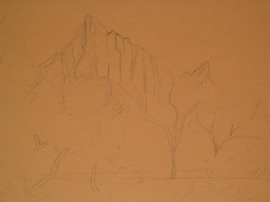
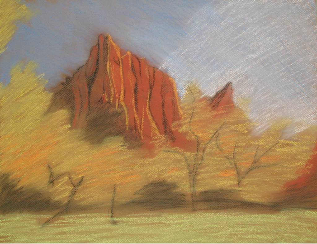
Well, after a nearly 6 month delay, I have finally finished "Mountains of the Fall". . .I think. The truth is, I never really know when a painting is done and this is no different.
Do not worry, I will be posting a photo of it soon so you can decide. It may need more work, then again, it may be over-worked. Just not sure.
And of course, now I think the title will need to be changed. The painting has become more about the trees in the foreground and less about the mountains in the background. Sigh.
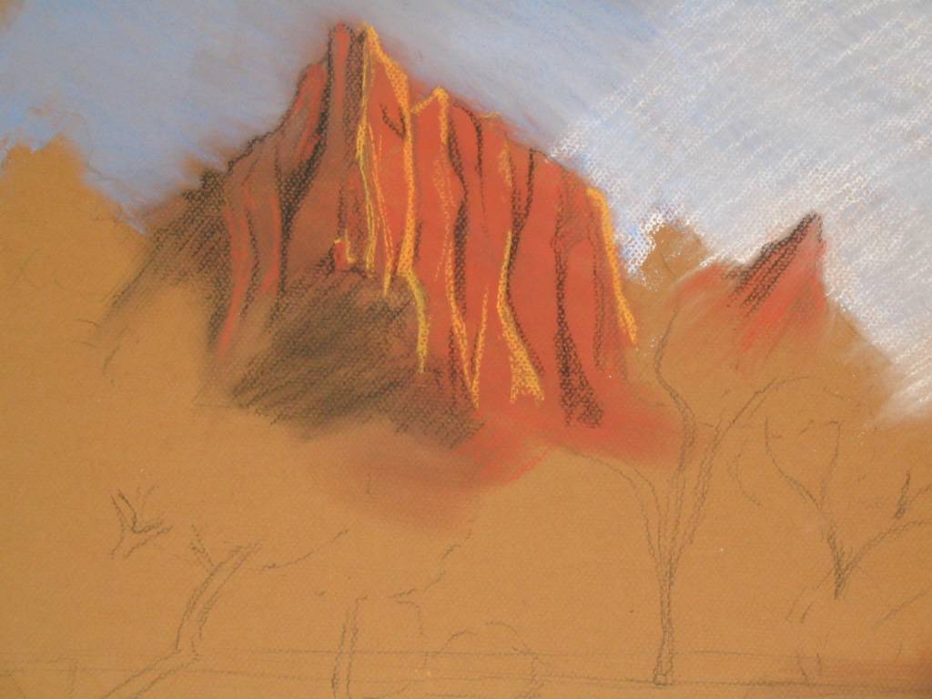
Now this took much longer to post than I had intended (or more precisely, I really have not worked on this in like forever). Theprogressingis coming along nicely, I just need to set some time aside to paint. I tried something a bit different and went right to work with the Unison pastels instead of the Rembrants. It turned out okay, but it just mearns that I will be using more workable-fix on the backend (which this piece desperately needs, if it ever is not raining and below freezing on the same day).
I really like how the deep purples folding into shadows, just the way I was hoping. I think with more details, this could turn out to be a very strong piece. Let's just keep our fingers crossed.
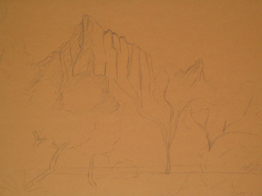
Mountains of Fall 16x20, charcoal on Canson Mi-Teintes board
Mountains of Fall (detail) 16x20, charcoal on Canson Mi-Teintes board
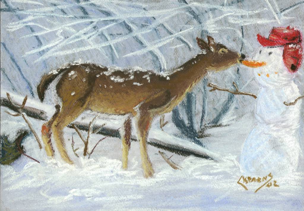
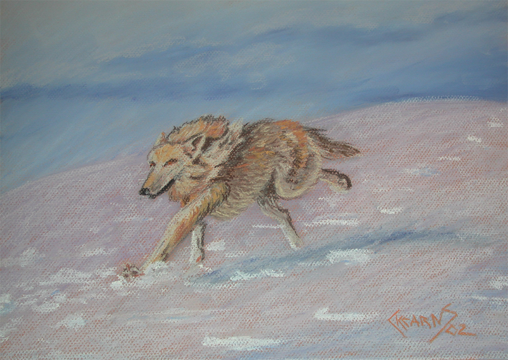
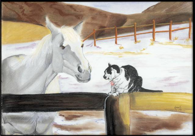
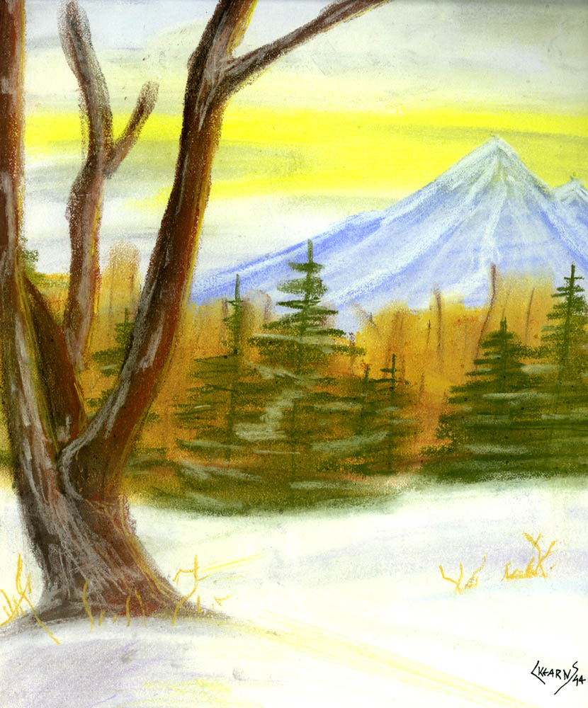
It would seem that paintings about snow are one of myfavoritesubjects. Just one of those funny observations that you make when you finally begin to catelogue the work you have done over the years.
I probably should have posted these a few weeks ago, it would have been more appropriate after the foot and half of snow that we received. And as should be evident from their style, these are older paintings done in the mid-nineties before I really knew anything about pastels and how to work them. I had no idea aobut uses workable fix to add depth. Nor did I know about the more expensive pastels. I was in grad school at the time and the $35 purchase for a set of landscape pastels was a luxury expense ($35 = 7 meals at Taco Bell). Glad I bought them. It is sometimes good to go back and look at the older stuff, it certainly gives me perspective.
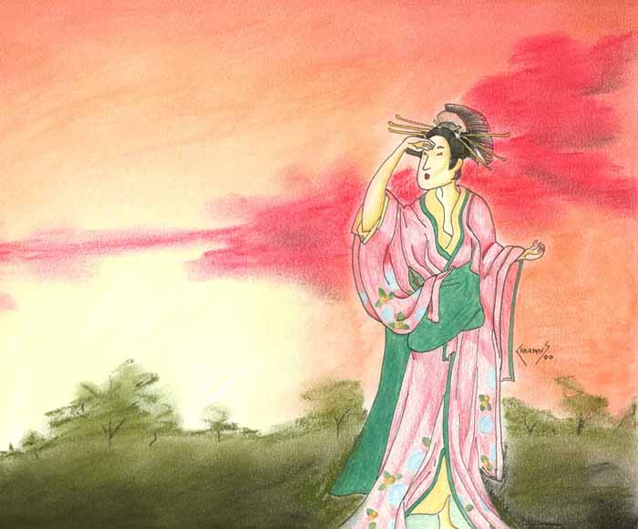
Been posting mostly grey and black and white pictures of late, so I wanted to show something with more color. This is one of those paintings that I like a lot, but am not so pleased with the name. Really had no idea what else to call it. I should track the original down and take a digital picture so that I can show the beach that she is standing on (why is all art pads 9x12 and all scanners 8.5x11?).
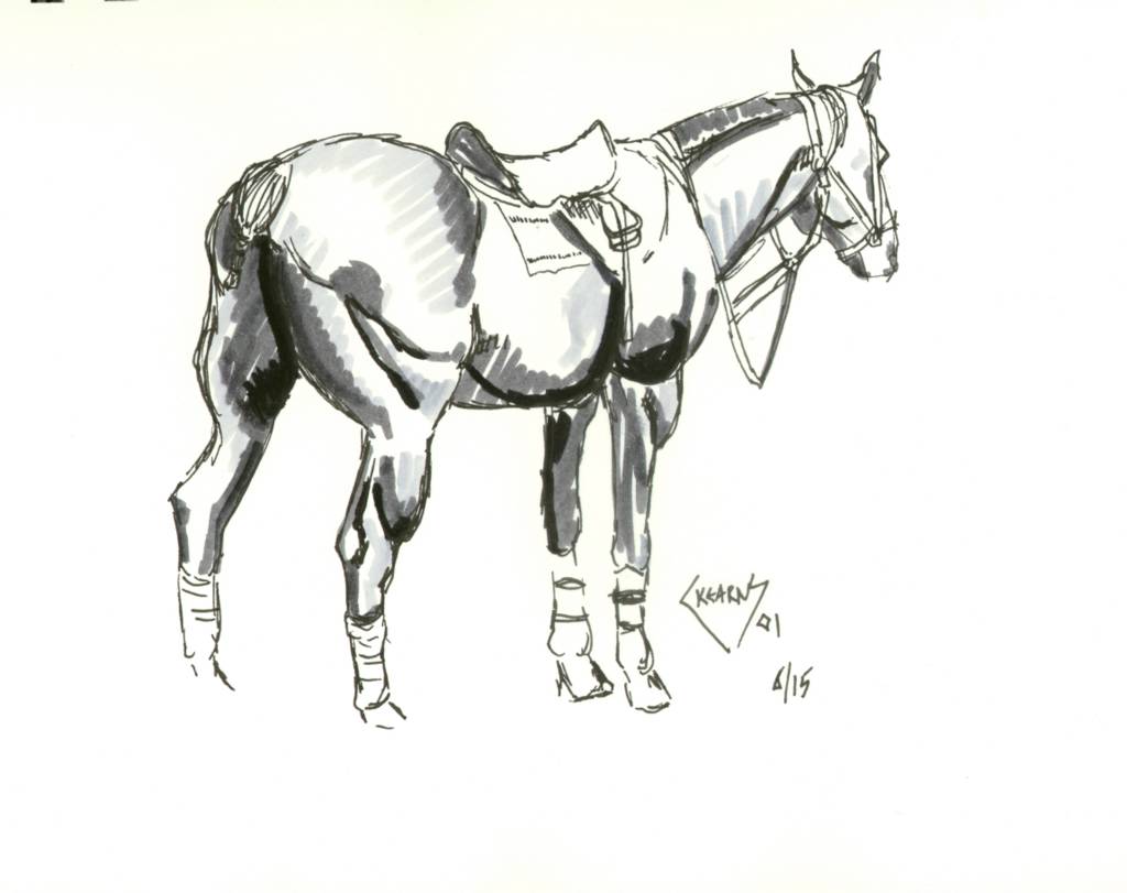
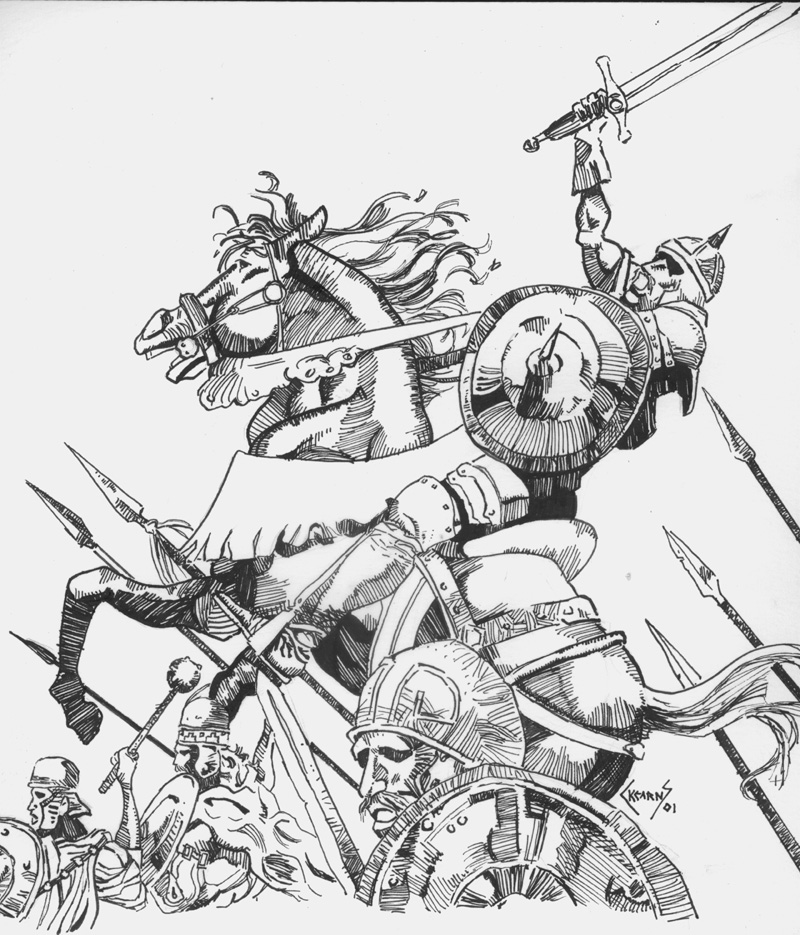
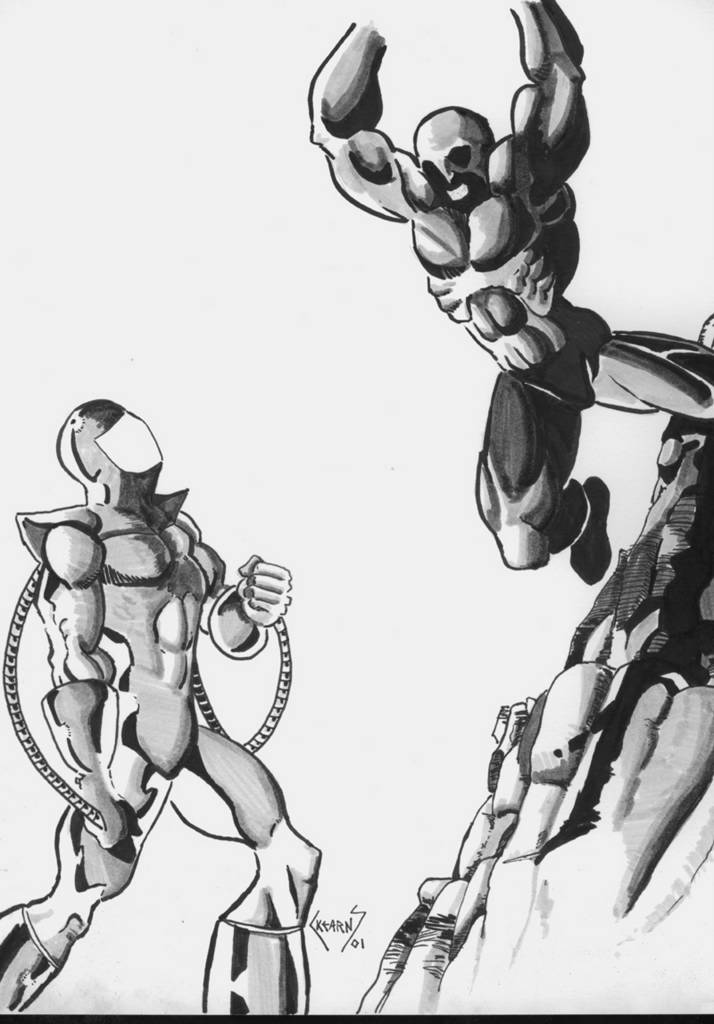
For those of you wholikedthehorses in the markers (that simulated wash), here are some more. A much different subject matter and one closer to what I wish I could do when I grow up. Hrrrumph, I want to be a comic book artist!!!
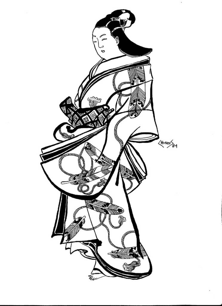
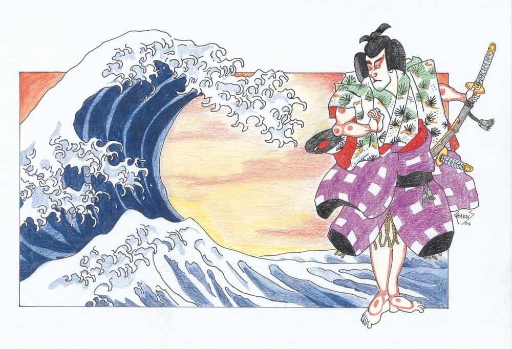
I love Japanese Art and although I have done some work inspired by Japan (and some out right swipes), I do not think that it has really influenced my style all that much. In college, I had a friend, Johnie C, who could create manga-esque illustrations that would make Shirow Masamune proud but I never really wanted to draw like that. Sure I thought it was cool as hell, but for what ever reason, it was not a style that I tried to imitate.
This picture was originally supposed to done completely in colored-pencisl and have a pagoda in the background. Several failed attempts to draw a realistic looking pagoda (that was in perspective) convinced me to try something. . .simpler. After much deliberation, I went with the pastel background you see now. Part of me wishes that I stuck with original design and part of me likes this result.
Geisha 2 9x12, colored pencil with pen and ink and pastel on bristol
I had hoped to post some new art work this week, but alas, the holiday break was not as productive as would have hoped. I blame it on the good books that I received and all those college Bowl Games. Don't fret, I have not forgotten about my latest pastel painting and I actually did do quite a bit of work on it. Just not enough to post. But soon.
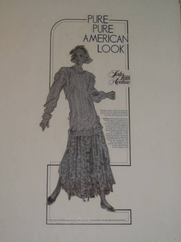
This finishes up the rest of my commercial art work (unless I find another vault of forgotten art, which is always possible). This is my first and only foray into furniture illustration, pretty satisfying, but not my cup of tea. But it does demonstrate to some (and you know who you are) that I can draw more than landscapes and women who can kick my ass. So there :P
The illustration started with a light pencil sketch followed up by wash (I used a sumi stick and not dilute ink). When it dried, then the pen and ink details were added. I really really like this combination of techniques and this just goes to show how much more versatile I was back when I was a teen-ager. The technique for the add is exactly the same as the fashion figure (I have the original lettering, but I am sure everyone is bored with those large sans serif letters). This one was never wrapped in ascetate and got pretty beat up, sorry about the glue showing through.
About ten years ago I had the opportunity to have this illustration shot on film by a rather large and expensive machine. I love the negative plate, it is so cool.
Hopefully, I get back to painting. So look for more paintings of landscapes. . .and. . .uh, pictures of. . .well, you get the idea.
Furniture Illustration 1ox15, wash with pen and ink on board






.jpg)